The stockings are hung by the chimney with care, in hopes that St Nicholas soon will be here!
Merry Christmas to all my blog readers. In spite of the long absences from my blog, I have been continuing to make books and have been very busy during the past few weeks with local craft markets and working on orders. In January, I hope to start working on more projects that I want to work on, rather than just orders from other people. That should give me more interesting work to share here on my blog.
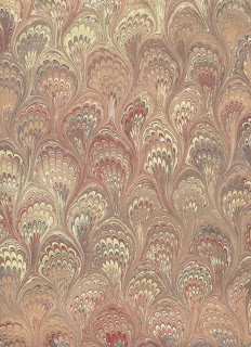
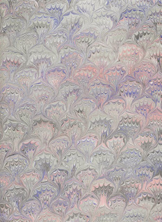
I had a chance to make a Christmas book for my mother this year; she needed a guestbook for an event she was hosting. It is a hardcover book bound using a traditional Japanese stab binding. Some of my own marbled paper is used on the covers with a little Christmas tree image inset on the front.
Happy Holidays to everyone and best wishes for a fabulous year in 2011.
Saturday, December 25, 2010
Thursday, December 02, 2010
Local Events - Dec 4 & 5
Tuesday, November 23, 2010
12 Days of Christmas - Nov 22 to Dec 3
Until December 3rd, I am participating in the 12 Days of Christmas event in conjunction with the Trans Canada Etsy Street team! This means, that all purchases from my shop during these 12 days, will earn ballots into a draw for a really fabulous prize! I am also offering Free Shipping on almost everything!
The ballots will earn you a chance to win a prize package of handmade goodies from TCET members and you can see the list of participating Etsy shops and the prizes by visiting our team blog. You can get one ballot without making a purchase if you share your letter to Santa.
Visit the team blog each day for fun holiday stories, recipes, pictures and more about each of the team members, as we count down the 12 Days of Christmas together.
Sunday, November 07, 2010
Woodblock Letterpress printing - 4
Our final woodblock letterpress class at the Dawson Printshop was a couple weeks ago and I never finished my blog posts to show the final results! Better late than never.
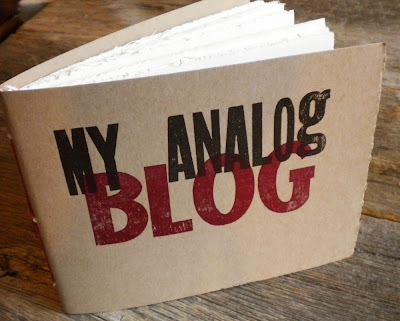
I was using the Kelsey parlor press to make notebook covers. I printed them in two colours, first "My Analog" in dark brown then "Blog" in dark red.
Another night, I was waiting to use the proof press and passed the time by using the parlor press again, printing a few more notebook covers that have a silver "ME" on them. I really like this font.
The final project that I did in class was assembling and printing this collage of many woodblock fonts. It is just a jumble, don't try to make it say anything clever, it is just letters A to Z and numbers 1 to 9 and a few punctuation blocks, arranged on the bed and printed all in one colour. I might use these as decorative papers in bookbinding; that's the plan right now, although I haven't done anything with them yet.
Thanks Niko, for a great introduction to letterpress!
Saturday, October 30, 2010
My first pop-up book
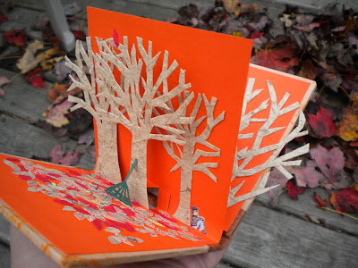
This is my first attempt at making a pop-up book. I didn't attempt any amazing pop-up structures; I just attached my trees to little pop-up squares made with two cuts on the fold.
I've submitted this book as part of a BEST challenge so you can vote for it if you like it! Or vote for whichever you like best - by visiting the BEST blog. There are some really great entries in the challenge this year.
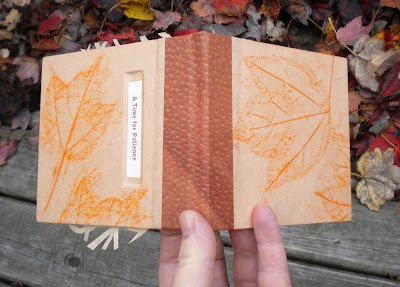
So, this is a Time for Patience. A handmade pop-up book to celebrate the procrastination innate in leaf raking. No sense starting until every leaf has fallen.
It is a 2-page pop up. So the first pop-up spread is a tree, barren of leaves, except for one at the top.
The second spread is a wider scene of that same tree and a couple others, with the rake and the raker and the fallen leaves, all waiting patiently for that last leaf to fall.
I also collected a few leaves and made some rubbings which are used on the covers of the book. Leather spine.
Monday, October 25, 2010
Gaspereau Press Wayzgoose
As I mentioned in the last post, I dragged my family to Kentville on Saturday to an open house at Gaspereau Press for their annual Wayzgoose. They also had other activities throughout the weekend like printing demonstrations, presentations, bookbinding workshops etc. I only made it to the open house. This is the first year that I have attended and they have been doing it for 11 years; maybe next year I'll get down to more of the events.
One thing I hadn't seen before, was this handy machinery that cast lead type in an instant. This is Andrew Steeves making a lead cast of my son's name - the whole process took only a minute and the lead was cool enough to hold when it came sliding out the front.
I also came away with a bundle of posters that were printed during the open house. Shown here top left, the BlUNT poster letterpress printed on a Vandercook proof press, then top right, a sample of some offset printing for the quotation from Henry David Thoreau. Bottom left, is the letterpress poster that Nicholas and Amos printed on another Vandercook proof press, and bottom right, a couple little cards printed on a parlor press using the lead cast that Andrew made a few minutes previously.
They also have an offcut paper sale, where you can buy offcuts of nice paper, and it's cheap. So of course, I brought home some paper too - bonus.
Saturday, October 23, 2010
Visiting Letterpress Artist - Amos Paul Kennedy Jr
Amos Paul Kennedy Jr is a letterpress artist from Alabama. He has been visiting Halifax this month with his work exhibited in one of the NSCAD galleries coinciding with the recent city-wide "Nocturne" art event. He also presented a couple of public talks and attended some classes at NSCAD as a guest artist and teacher.
There is a gallery of some of his work on his website (www.kennedyprints.com). He designs and prints some terrific posters, including a great series on the virtues of coffee. Many of his posters are very clever and entertaining but many are also very serious in their message, dealing with a wide range of issues like racisim, civil rights, ecomonics, artistic freedom, etc. Apparently he served in the Peace Corps and also studied and worked as a computer programmer in previous lives, but left that behind to pursue the creative life of a letterpress artist. There is a very good article about him on the Daily Mountain Eagle website.
His visit to Halifax also happen to coincide with my last letterpress class earlier this week. He visited our class so it was nice to meet him and have a chance to talk to him a bit. And I saw him again today at the Gaspereau Press Wayzgoose where he was demonstrating one of their Vandercook proof presses and helping people print souvenir posters. I had packed up the whole family to go to the Wayzgoose, so my son got to print the souvenir poster - with some help from Amos.
Wednesday, October 13, 2010
Woodblock Letterpress printing - 3
Someone mentioned that I never showed a picture of those Christmas cards after printing the second colour. "Merry" was printed first in black, then "Christmas" was printed on top in silver. So here's how they turned out - some were printed on red and some on white...obviously.
After those were done, I started another project using a different kind of press. Here is one of the Dawson Printshop's parlor presses, all inked up with red right now.
This is a Kelsey parlour press; it is a table top press and it is entirely manual. Using this was much different than the comparably gigantic proof press that I was using before. Niko was explaining to me that these small parlor presses were really common in Victorian times when printing was a popular hobby and people just wanted to have one in their home, and of course they kept it in the parlor. So I used this press to print a cover for a notebook. I printed the second colour on them last night so now they are just drying and I'll make them into notebooks and show off a finished one here soon. We have one class left - I've already started something to keep me busy during those last three hours.
Tuesday, October 05, 2010
Autumn Leaves
This is my Autumn Leaves / Autumn Memories journal that I made for the current TCET Challenge! That's a photo of my kid a couple years ago, buried in a pile of fallen leaves. Drop by the TCET blog to vote for your favorite handmade item. Also, if you have an idea that you think our team should use for our next challenge, leave a comment and we might pick your idea!
Go here to vote:
transcanadaetsyteam.blogspot.com
Saturday, October 02, 2010
Morgan Conservatory Open House and Auction - Today!
The Morgan Art of Papermaking Conservatory and Educational Foundation is an Ohio non-profit art centre dedicated to the preservation of handmade papermaking and the art of the book. I have met some of the key persons involved in the centre through my attendance at PBI in previous years. For its third year, The Morgan is having their annual Open House and Auction, today, October 2 from 6 to 10pm. So if you are in the Cleveland area, check it out at 1754 East 47th Street.
The silent auction will raise funds for The Morgan and its programs. Many of the auction items are made with, from, on, or otherwise featuring handmade kozo paper, made on site. There are also many other art objects for auction as well. Many well known artists, paper makers, and book artists are involved in this event and have made the items for the auction. And some not as well known - in fact, this leather journal, by me, is one of the items available (I didn't have any of their kozo paper to use). It features a full leather cover with an abstract floral detail, with marbled endpapers (marbled by me). Pages are Mohawk Superfine cream.
Wednesday, September 29, 2010
Woodblock Letterpress printing - 3
During our third class I was able to print the second colour on the cards that I started last week. Here's one of the cards coming around on the print roller, with the silver text now printed on top of the black.
I also got some pictures of the bookbinding gear that lives at the Dawson Printshop. You know you want a paper cutter like this one. It can cut through anything - paper, book board, arms...
More gear, presses, hot stamping machine, finishing press... imagine having such equipment at your disposal!
I also got some pictures of the bookbinding gear that lives at the Dawson Printshop. You know you want a paper cutter like this one. It can cut through anything - paper, book board, arms...
More gear, presses, hot stamping machine, finishing press... imagine having such equipment at your disposal!
Sunday, September 26, 2010
Discoveries of an amateur marbler
When I first took a marbling class in 2008 with Nancy Morains, she provided a bouquet rake so that we could try making that classic pattern. Her bouquet rake (or double rake) was made to fit her tanks perfectly and it seemed almost effortless! Well, the results from the class were far from perfect, but they were recognizable. Here is one that I did in that class - I think the biggest problem with this is the globby paint, not the technique with the rake. Yikes.
After that class, I set myself up to do some marbling at home. Alas, I did not buy myself a bouquet rake because I thought I could do it with two passes of the standard rake. That technique, however, never worked very well for me. So I gave up on it for a while. Eventually, I made myself a bouquet rake and still couldn't get it to look right.
I made a substantial effort to improve my bouquet rake technique during my last marbling session. Many papers were terrible and discarded immediately.
Many others were mediocre. I could tell they were a little better, but still wobbly and almost out of control with bouquets of all different shapes and sizes. Like this...
Then I discovered something. I discovered that my bouquet rake made small bouquets! It started working so much better! I had to nearly stand on my head to watch the pattern emerge as I used the rake, to see what was happening and then it all came together - understanding the spacing of the nails was far more important than I realized. This is probably the best example, so far.
As you can see, the bouquets are quite small; but finally, they are nearly consistent in size and shape.
Also, a rather successful Frog's foot pattern too (or thistle pattern?) using the same rake.
I will continue to practice. Also, I may try to make myself another double rake with more spacing. But after all this, I think I made it over a little hump.
If anyone reading this has any advice about making the bouquet pattern, or anything at all to say about it, I would love to hear from you!
Wednesday, September 22, 2010
Woodblock Letterpress printing - 2
Last night I went to my second class of woodblock letterpress printing at the Dawson Printshop. The first project is a simple greeting card and last night I was able to print the first colour on mine. We were using a Vandercook Universal 1 proof press.
Definitely a big part of the fun is looking through the drawers of type, selecting fonts and designing the layout and all that. So, here is the wooden type that I picked out and arranged, set on the bed of the printer and ready to go. ("Bed"? Is that the right word? Still not overly confident with the lingo!) I do like how the extra wooden blocks for spacing are called furniture. (So maybe it is a bed.)
I was the first one to start printing so Niko was using my session as a demo for the class so she is here helping me get started.
In the end, I have the first colour down on the cards. Here are a couple of the test prints -
Another member of the class was taking lots of pictures for me, thanks Radhika!
Monday, September 20, 2010
Preparing for 2011
Every year around this time, I start making these leather weekly planners. So if you are one of those people who come back every year for a new one, here they are, now available on Etsy or Artfire now so you can get ready for 2011. Let me know if you want one made in a favorite colour!
Saturday, September 18, 2010
Woodblock Letterpress printing - 1
Earlier this week, I started a woodblock letterpress class at NSCAD. So for the next six weeks, I'll be playing with wood type. NSCAD is now the home of the Dawson Printshop which used to be at Dalhousie University when I was studying there. So even though it is a new location, it's still familiar. The Dawson Printshop has, literally, tons and tons and tons of equipment and type, both metal and wood. Several antique presses and dozens of huge of cabinets full of type. The instructor is Niko, of White Raven Arts, a fellow member of BEST and an experienced letterpress printer and Dawson Printshop maven.
Rows and rows and rooms full of cabinets of type...
Tuesday, August 31, 2010
That special project, followup
The journal project that I mentioned in the last post, will include handmade books from several other bookbinders that are all members of the Bookbinding Etsy Street Team. Here are some of the other contributions:
- Buechertiger
- CinderLisa Design
- Kristin Crane
- Minus + Minus
- Tickerfinch
- PaulinePaulette
- Roundtheworldin80pgs
There are sixteen books that will be "adored and adorned by creative women around the world." Each women will create a 4-6 page story in one of the journals, written and illustrated to show who or what made a difference in their lives and their advice for other young women. A short film will be made to tell the story of the books and the ideas, and the film will be premiered at the first TED Women's Conference in December and the books will be displayed and shared at a gallery event.
Thursday, August 12, 2010
Journals for a special project
Hardcover, flat back binding. Front cover uses my own hand marbled paper. Spine and back are cream Japanese book cloth. Three round windows in the front cover containing seeds and bits of dried flowers. End papers are painted. Custom box.
Soft cover, wrap-around with chopstick closure, longstitch binding. Cover is patchwork leather, adhered to heavy cowhide and hand-stitched. Pages are heavy watercolour papers and end papers are bright red handmade paper. Custom box.
These are two journals that I made for the Levi Strauss company when they contacted me about a project they are doing, The Levi's Anthology. There will be fifteen handmade journals (made by women) sent to various women around the world to fill with their thoughts and ideas, seeking to capture the essence of what has shaped young women, what's relevant to them in 2010, and what advice they would have for other young women trying to shape their own worlds. Ultimately, when the books are completed, they will be featured in a film along with some of the women who wrote within them and the books will be made available for viewing at a gallery.
Saturday, July 17, 2010
Beautiful Books & beautiful baby!
Earlier this week, I visited the Anna Leonowens Gallery, which is an art gallery at the Nova Scotia College of Art and Design. There were two concurrent exhibits that I wanted to see.
The first exhibit was all the winning books of the 2010 Alcuin Society Awards for Excellence in Book Design in Canada. Thirty books were selected for the awards, chosen from 252 entries published in 2009, from 108 different Canadian publishers.
It was nice to see so many beautifully designed books all in one place. I especially liked one of the children's books City Alphabet by Joanne Swartz, which received an honorable mention in that category. It is a modern abcedarian using imagery and words captured in our urban landscape. A couple of the books in the reference category were among my favorites too. Living Proof: the Essential Data-Collection Guide for Indigenous Use-and-Occupancy Map Surveys is a gorgeous book. The title may not sound very exciting to some, but the presentation of the content is irresistible - even if you don't have a penchant for reference books!
I was disappointed to find that the winners in the Limited Edition category were not on display, boo! I would have liked to see those. If you are interested, there is a full list of the winners on the Alcuin Society's blog.
The second exhibit, was Tactile Notebooks and the Written Word. This was a collection of journals filled with all manner of text, image, object, etc, that were created by NSCAD students in a class where their goal was to "to heighten their sensory experience, expand understanding in unexpected directions, and deepen their artistic vision." It was fascinating to flip through these books and see and feel what each of the artists conveyed.
This visit to the Anna Leonowens Gallery was refreshing since I have been just a little out-of-touch with the book world over the past few weeks. Obviously, since I haven't added anything to my blog for over a month! Apologies for that. As some of you know, my little girl Mallory was born on June 20th so she has been distracting me! As we settle into a new routine, I plan to get back into my bookbinding studio occasionally.
Introducing Mallory! Born June 20, 2010
The first exhibit was all the winning books of the 2010 Alcuin Society Awards for Excellence in Book Design in Canada. Thirty books were selected for the awards, chosen from 252 entries published in 2009, from 108 different Canadian publishers.
It was nice to see so many beautifully designed books all in one place. I especially liked one of the children's books City Alphabet by Joanne Swartz, which received an honorable mention in that category. It is a modern abcedarian using imagery and words captured in our urban landscape. A couple of the books in the reference category were among my favorites too. Living Proof: the Essential Data-Collection Guide for Indigenous Use-and-Occupancy Map Surveys is a gorgeous book. The title may not sound very exciting to some, but the presentation of the content is irresistible - even if you don't have a penchant for reference books!
I was disappointed to find that the winners in the Limited Edition category were not on display, boo! I would have liked to see those. If you are interested, there is a full list of the winners on the Alcuin Society's blog.
The second exhibit, was Tactile Notebooks and the Written Word. This was a collection of journals filled with all manner of text, image, object, etc, that were created by NSCAD students in a class where their goal was to "to heighten their sensory experience, expand understanding in unexpected directions, and deepen their artistic vision." It was fascinating to flip through these books and see and feel what each of the artists conveyed.
This visit to the Anna Leonowens Gallery was refreshing since I have been just a little out-of-touch with the book world over the past few weeks. Obviously, since I haven't added anything to my blog for over a month! Apologies for that. As some of you know, my little girl Mallory was born on June 20th so she has been distracting me! As we settle into a new routine, I plan to get back into my bookbinding studio occasionally.
Saturday, July 10, 2010
A little history of the Chain Stitch
Early multi-section Coptic codices
Dating from the 2nd century AD, the Copts used a chain stitch to bind multi-section books. In most documented cases, it seems that these books were sewn with a continuous thread and a single needle. The first and last sewing stations thus having half the number of loops as the other sewing stations. There are variations in the chain stitches from this period, though, since the technique was still in development. The cover would be made separately & attached after the textblock was sewn, covering the book completely including the spine. The textblock was attached by pasting it directly to the covers.
Later Coptic codies
After about the seventh century, there are very few extant Coptic bindings and most remnants are very badly damaged but it is evident that the chain stitch was still used. It also seems that the cover boards started being attached as part of the sewing process – unlike the separate attachment of the cover described above for the early Coptic codices.
Ethiopian Codices
Dating from about the sixteenth century, chain stitch binding had also evolved in Ethiopia. These books typically had paired sewing stations, sewn using two needles for each pair of sewing stations (so if there are 2 holes, use 2 needles…or 6 holes, 6 needles etc). The covers were wooden and attached by sewing through holes made into edge of the board. Most of these books were left uncovered without endbands.
Byzantine bindings
There were also Islamic bookbinding methods employing the link stitch, and Byzantine/Greek bookbinding methods using a link stitch. An interesting variation employed by the Greeks was sewing the sections in two groups, then joining them so the chains meet in the middle. This makes it look like the chain stitches change direction in the middle of the row. The Byzantine bindings are more likely to have elaborate endbands which are worked onto supports and anchored to the cover boards through holes in the boards. These books typically had full leather coverings.
This quick summary is largely based on information in Szirmai’s text, The Archaeology of Medieval Bookbinding. There are five chapters dedicated to link stitch bindings so this is really a miniscule summary of what I read.
There is some debate surrounding the various terms used to described the chain stitch binding methods that are so often used today, especially concerning the very loose application of the term "Coptic binding." Ekthesis has a nice article about the Coptic binding which includes some discussion of these issues.
Photo courtesy of The Crafty Kitten
Originally posted to the BEST Blog, Oct 2007
Thursday, June 10, 2010
More Patchwork Journals
I had so much fun making the last batch of patchwork leather journals, that I made another batch. These are now available in my Etsy shop, of course.
Each of the wrap-around covers are assembled from my heap of leather scraps, adhered to a larger piece of leather, then stitched to keep the pieces secure. Reclaimed buttons and braided cord closures finish the covers. These ones have all blank unlined, new, recycled paper for the pages (rather than pre-used blue-box papers like the last bunch). The binding is a longstitch and chain stitch combination, sewn directly through the covers.
Wednesday, June 02, 2010
More books from boxes
I just have to show some books I recently made by request using fun boxes. Because, not only is it fun to have all the products that are advertised on television, it is even more fun to have notebooks made from the boxes.
The Graty and SlapChop combo, of course.
The Snuggie, and yes, the Snuggie for dogs.
The Graty and SlapChop combo, of course.
The Snuggie, and yes, the Snuggie for dogs.
Subscribe to:
Posts (Atom)