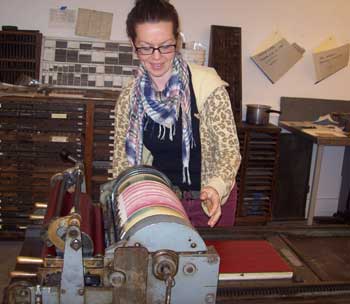
As I have become more involved with letterpress and bookbinding the past couple of years, I saw this class as a perfect opportunity to combine my old love (painting) and my new love (book arts). This was my first time at PBI and I wasn't sure what to expect. Knowing absolutely no one, being pretty new to the whole book arts scene, and prone to bouts of stifling shyness, I wasn't sure what was going to happen. I'm happy to say, it was incredible. Topnotch instructors and intense studio time in a gorgeous environment with kind and interesting people. I learned so much and made book arts buddies from all over the place. Who wants to go back home? Ever?
Yet we did have to go home and luckily a nice thing about technology is that it helps keep these new connections with people going through e-mail conversations, collaborations, and knowledge sharing. Like this blog! So, the instructor for Pressure Printing: A Painterly Approach to the Press was Sarah Bryant of Big Jump Press (www.bigjumppress.com). Sarah is a combination of letterpress ninja, energetic motivational presenter, comic relief...and of course, an amazing printer/artist/lady. If you have ever been fortunate enough to attend PBI you know the first week is broken into two sessions with about twelve students in the morning, twelve in the afternoon. With that said, there was exactly one Vandercook to use for 24 students. Sarah was able to keep us all on task and bestowed her magic-juju-catchphrase "Cross your fingers, turn around three times, and spit!" to help our prints turn out their best. It must have worked because everyone's pieces were so varied and beautiful.
Pressure printing is a form of relief printing and differs from traditional printing in the way that image/text you print is behind your paper on the feed board of the Vandercook, instead of on the bed itself. You create a "plate" that is placed behind your paper. The plate can be paper or mylar with your created image(s) cut and pasted on with spray adhesive or glue stick.
The impression is adjusted by placing packing (sheets of paper) behind your plate before you print, in order to get the desired amount of ink for your image. Too little packing, and your image will not show up, too much and it could be obliterated when the paper and plate meets your inked surface. An exact science it is not....and of course the majority of letterpress printing is pretty exact. This way of printing lends itself to all kinds of experimentation. I chose to keep it simple, but many students planned and printed multiple images and textures within one piece.
The type high block on the press bed acts as your inked surface. It can be inked by the press rollers or with a brayer. You can also get fancy and carve into the block or cut images to place on top of this block. Others more well versed in printing, like my Vandercook buddy Suzanne Sawyer, experimented with creating both a plate and an inked surface with a relief image. Suzanne is a very talented artist who incorporates images of plant cells within her work and she chose to do so in this class as well. I think she really achieved a beautiful aesthetic while showing what one can do with pressure printing.
I loved the subtle wash of color from pressure printing, not having to use any kind of measuring device, and the ability to just cut paper to create images. If there had been more time, I certainly would have enjoyed experimenting with the interaction of colors and the inks, carving a block, and monkeying around with the amount of packing. I think the best approach for me with PBI classes was to try and really treat them as a learning experience; to focus on the process and learn from it, rather than trying to make an amazing work of art at the first go. This was a hard thing to do at times with all the book arts rockstars about, but it kept me from stressing too much about the end product. Like when teaching children, I had to remind myself it's not about being done first, but to check myself to see if I understand what I'm doing, not be timid about asking questions, and assess if I am putting forth my best effort. This was truly an inspirational and timely class as I continue my adventure into the world of book arts.
Friday, July 12, 2013
Guest Blogger Bonnie Loukus, and Pressure Printing at PBI
Bonnie Loukus works as Assistant Director at the Copper Country Community Arts Center, a non-profit organization, in Hancock, Michigan. She is currently working towards establishing a letterpress and book arts studio within the center. At PBI in May, Bonnie had the great fortune of taking letterpress class with Sarah Bryant. Thank you, Bonnie, for telling us about the class.
Thursday, July 04, 2013
Guest blogger Ann Poe, on paring leather with Jeff Altepeter
Ann Poe is a retired editor who happily continues to explore book and paper arts. This was her fourth time attending PBI and she very kindly offered to do a review of one of her classes for my blog. She had the great fortune of taking a leather class with Jeff Altepeter (I really wanted to be in this class; however, they won't let me take them all!). Thank you for sharing your thoughts, Ann!
This was primarily a technique class about working with leather. We learned the differences among animal skins, how the skins are affected by finishing processes and dyes, why one skin can have different properties, and more. Jeff provided a wide variety of leathers for students to use for practice. Some skins were thin, moist, smooth, and easy to use; others were dense, dry, stretchy, wrinkly, and considerably more challenging to use.
We pared leather with the Schärf-Fix – a must-have tool for every bookbinder. Jeff demonstrated many tips and tricks as we learned to pare a large piece entirely, edge pare German style, back pare, pare onlays, determine thickness with a micrometer, and more.
And then we moved on to paring with knives. He showed us the most useful blade shapes, how to use each one to pare and bevel, and again we were able to practice on a variety of leathers. For those who were interested, Jeff gave an invaluable demo on sharpening knives.
We made leather-covered plaquettes. These were excellent models for practicing new techniques with glue and paste, including how to apply paste, how to adhere leather to bookboard, and of course, how to cover corners. We also practiced onlays, including how to make a raised, tooled edge onlay, and how to get a colored, tooled, curved line onto leather.
So that students could concentrate on leather covering techniques, Jeff provided a textblock for each student. (Thirty textblocks later, surely he deserves a medal!)
We added covers, using leather to cover the spine and form a proper headcap over the headband.
I really enjoyed this class. It's always exciting to discover a new lode of information – and this class was a gold mine!- Ann Poe
Monday, July 01, 2013
Happy Canada Day!
Happy Canada Day! I'll be spending the day in Dartmouth, NS at the Alderney Landing Boardwalk Artist Festival and I'll be selling my books there. Come for a visit if you're in the area; there is always lots of fun things happening there on Canada Day.
Wednesday, June 26, 2013
Guest Blogger Alison Kurke on Tim Ely's class at PBI
Alison Kurke is today's guest blogger. She is a maker of gorgeous books and fabulous collages; she lives in Italy and is always on the lookout for good red wine. She has very kindly shared her thoughts here about Tim Ely's PBI class (Tim's website www.timothyely.com).
Alison also has a blog, which you can visit at kurberry.typepad.com/eccleccticca and you can view some of Alison's work on Flickr. Check out her book making projects and her collages. Thank you, Alison.
I signed up for Tim Ely's class at PBI 2013 (Ideas and Actions in Context and Construction) for all the wrong reasons, believing it to be the course I'd missed last summer, taught by someone else entirely. Enormous brain fart, but also a stroke of luck, since it seems to have been the hot-ticket class that everyone wanted to take. The title and description were enigmatic. So enigmatic that I had no idea what would be covered. I knew only that I was stuck in a rut churning out blank, and "almost-blank" books to delight other people, and spending most of my time fabricating collages or assemblages for their covers. Those were the elements that interested me most, rather than the sea of blank pages.
The materials list was vague, but curiously extensive, especially for someone not in the habit of drawing ("Bring your existing sketchbook"…"What do you seek to understand more deeply?" Where to begin?). After hearing Tim deliver a lecture the first evening about his work I was actively worried. This was a man, a rather unusual man, it appeared, who invented languages, sciences, and entire solar systems in beautifully made books. Self-contained, obsessed, clearly highly intelligent, productive, ingenious. His natural curiosity and endless capacity to invent and record was manifest in his books. He reassured me that I'd be fine despite my anxieties about being found wanting and incapable. And I was fine, despite enduring the ridicule of fellow PBIers for lugging my too voluminous (and mostly unnecessary) supplies to and from class in a conspicuous, wheelie carry-on bag.
I am so satisfied with what I learned from Tim. Not only a new book form or two, but books that open flat - a revelation for someone like me who is allergic to coptic bindings. Who knew how adaptable drumming on could be? Who even knew what it was before Tim's class? Perhaps everyone present but me.
Who knew that perfect mitered corners were possible, reproducible and sort of easy to attain? Who knew that fabric, mine an 1830s cotton print acquired 100 years ago in the UK, could be turned into amazing and versatile book cloth though the application of a wheat paste made from Swan's Down Cake Flour? That this very paste could be mixed with some medium and some acrylic to make actual paste paper? Now I know. A new world has opened up before me.
He unselfishly shared with us his wisdom acquired over decades - tools, tips, tweaks. Although Tim's intention had been to teach us and help us model three variations of this hollow-backed/drum-leaf binding, we managed only two, but almost all of us with variations and quirks of our own. Tim's well-advised system of starting a sketchbook involved adding some decoration or drawing to the folios before binding them delayed us, but everyone in the class enjoyed the time dedicated to making some marks and the results were varied and interesting.
His books are "sketchbookthinkingvehicles" - diaries, idea books, repositories of concepts both fully-formed and stimulative. His books are precisely measured, expertly trimmed, lovingly planned. Mine, are perhaps none of those things, but I love them all. They can be commemorations, springboards, friends, to be added to and referred to forever. They are the histories of ourselves that we leave as monuments to our creativity. Taking the class has challenged me to try to put my best self there. I am hoping to rise to that challenge.
- Alison Kurke
Wednesday, June 19, 2013
Guest Blogger Victoria Cowan, on Finesse Papermaking at PBI
Victoria Cowan is my guest blogger for today. She is an award-winning artist and a gifted instructor. Both experimental and productive, she shows new work regularly in a number of venues, and is much in demand as a workshop leader. Because her preference is to explore an idea in depth, Victoria usually makes a series to follow the branches of an original inspiration. Perception, cognition and memory are her particular areas of interest. For more about Victoria, visit her website at www.victoriacowan.ca. Victoria attended her first PBI this year and started her first day making paper in Bernie Vinzani's class. Thank you for sharing your experience here on my blog and I am looking forward to seeing what you do with your papers in the future!
First class of first day and, typical of me, it only took me a few minutes to put my foot down my throat, not wanting to share a screen. And who did I 'reject'? Why none other than the instructor of my class in the next session. Some days one just does it all off kilter! My reason was clear enough to me (hoping to use the paper I made in an artists' book and thinking that it would lend itself to a good layout if the watermark only took up one side of the sheet), but perhaps I could have done it differently? So I am very appreciative of her not holding it against me.
As an experienced instructor myself, I was impressed by Bernie's exhaustive hand-outs on paper-making. He is also a deeply thoughtful person—he brought an historic document from a paper-making company in Scotland to show to me, because their name was the same as mine.
Bernie showed us how to apply our watermarks to our screens. Since mine was quite simple, I was ready to make a sheet quite quickly. And luck was with me; the very first one had no clumps, bumps or tears. Bernie publicly announced it; I was no longer a paper virgin.
Everyone was very helpful and there was much interpersonal questioning and showing of methods.
Tom let me try his beautifully made small mould & deckle. Annie responded generously when, looking over her shoulder at her mixing different colours of pulp and flinging tears at the screen with abandon, I asked, "Er . . .what are you doing?" The sheets I made as a result are among my favourites because they are so painterly and could become a rich ground for a series of prints.
We used different kinds of pulp—including an abaca and hemp mixture, and cotton. Comparing them with what I'd seen when people experiment with using a hand drill for beating pulp in a pail was an immediate and powerful lesson in the importance of a good beater and well-made pulp. Thanks, Andrea!
Now that I have such luscious sheets, each unique, each both delicate and strong, I'm almost afraid to use them. You know . . .it's that old artist thing about not ruining one's canvas, whatever that canvas happens to be. But I'll get over it, and hope I may guest blog again at that time and show you all what I did.
Because the first two days were wintry and the concrete floor very cold and wet, I was wearing thick-soled winter boots made with a waterproof fabric. Shudda known better! I'm pretty sure they are now transformed forever, a souvenir of my first days at PBI that will always make me grin.
- Victoria Cowan
Monday, June 10, 2013
Guest Blogger Charles Wisseman, on Daredevil Letterpress at PBI
Charles Wisseman is a retired pathologist who now does mixed media art with a current emphasis on book arts and papermaking. Charles lives in Champaign, Illinois and has a website where he shares some of his work: www.charleswisseman.com. Charles took a letterpress class at Paper and Book Intensive last month where they were literally printing in circles, and any other shape they could manage.Daredevil Letterpress was taught by Jessica Spring, who teaches in Washington State and runs Springtide Press. She encouraged us to think outside the rectangular box when setting up a letterpress layout. Everyone liked the type held in a circle between a roll of tape and a pipe clamp. This opened our mind to the possibilities, and each participant took a different approach.
Printing circular type.
Printing curvy type.
We all were introduced to the wonders of the California job case, the pica pole, the Vandercook press, mixing ink, cleaning up in the least toxic manner, etc. People were encouraged to do prints with more than one color, and to try for a high level of quality.
There is only one Vandercook press in this studio, so print time had to be scheduled. Jessica spent long hours monitoring the printing. Despite the scheduling difficulties, there was a very cooperative atmosphere.
I decided to use the poster press, on loan from the Morgan Conservatory, because this is what I have at home. I have some wood type, also, so I did a layout of wood type held in a galley tray by a carved-out 1/2 inch foam core. Others liked this method of holding type and made complex and sinuous arrangements of type and image. I opted for all hand inking in the poster press to give a very variable edition for the class portfolio. I also tried some of the pressure printing techniques I had seen in the Sarah Bryant class the week before.
Examples of class work
Others did complex linoleum cutouts, water color additions, sewn in thread, images in speedball cutout material, and color gradients. I had little previous experience in letterpress, so all of this seemed daring enough for me. The portfolio looked great, and one set sold well in the scholarship auction. Thanks to PBI for bringing in this innovative and humorous instructor.- Charles Wisseman
Thursday, May 30, 2013
Pre-Raphaelites and the Book
On my way home from PBI, I found myself delayed in Washington, DC with enough time to visit the National Gallery of Art. I was excited to find that they were currently exhibiting a small special collection of items concerning a few key artists from the Victorian era, who were particularly interested in combining words and images in the book form. The exhibit included work by William Morris, Edward Burne-Jones, John Ruskin, Dante Gabriel Rossetti, and a few others. This little exhibit seem to fall right into my lap, pulling together my long-time appreciation for Victorian literature and my study of the book, and type, and even page design.
I've been fascinated with William Morris for a long time. He was involved in every aspect of the book. He wrote poetry and prose, he created type faces and illustrations and fabric designs, did experiments in bookbinding and printing, and eventually founded Kelmscott Press. This first image shows Morris' novel The Roots of the Mountains, and he was involved with all the page design and printing and it is bound in fabric that he designed.

Morris designed all the ornamentation for Kelmscott Press and this little exhibit included an example of some of his decorative uppercase letters.

Here's another example of Morris' work inside a book: an elaborate border design, ornamented text and illustrations, etc.

Puling myself away from William Morris, I found also this title page by Edward Burne-Jones, apparently his very first commissioned work.

In addition to the more elaborate paintings and engravings, Edward Burne-Jones also made a lot of quick sketches and caricatures of his surroundings. There were a few of these sketches on display, including this one of his wife studying at the table, surrounded by books and observed by a cat.

Another item that caught my attention was this edition of Christina Rossetti's poems, which was illustrated by her brother Dante Gabriel Rossetti. Dante Gabriel also designed the elegant binding for this book, as he often did for his own books.

Such was the highlight of my 30-hour delay. It was a small exhibit in a small room, and according to the pamphlet, there were only 34 items on display. I did, however, spend more time in this little room than I did in any of the other exhibits at the gallery. This exhibit was scheduled to close on May 19th even though I was there on May 24th, so maybe if you hurry, perhaps they haven't removed it yet!
I've been fascinated with William Morris for a long time. He was involved in every aspect of the book. He wrote poetry and prose, he created type faces and illustrations and fabric designs, did experiments in bookbinding and printing, and eventually founded Kelmscott Press. This first image shows Morris' novel The Roots of the Mountains, and he was involved with all the page design and printing and it is bound in fabric that he designed.

Morris designed all the ornamentation for Kelmscott Press and this little exhibit included an example of some of his decorative uppercase letters.

Here's another example of Morris' work inside a book: an elaborate border design, ornamented text and illustrations, etc.

Puling myself away from William Morris, I found also this title page by Edward Burne-Jones, apparently his very first commissioned work.


Another item that caught my attention was this edition of Christina Rossetti's poems, which was illustrated by her brother Dante Gabriel Rossetti. Dante Gabriel also designed the elegant binding for this book, as he often did for his own books.

Such was the highlight of my 30-hour delay. It was a small exhibit in a small room, and according to the pamphlet, there were only 34 items on display. I did, however, spend more time in this little room than I did in any of the other exhibits at the gallery. This exhibit was scheduled to close on May 19th even though I was there on May 24th, so maybe if you hurry, perhaps they haven't removed it yet!

Friday, May 10, 2013
It all starts this weekend
I am getting ready for another Paper and Book Intensive. I'll be on my way, traveling to Michigan this weekend and then I'll spend the following ten days doing some intensive paper and book learning! There is, as always, a very impressive cast of instructors this year. I'll be taking classes with Adam Larsson, Paula Jull, and Yasmeen Khan. It's all happening at Ox-Bow near Saugatuck. I'll post some updates over the next couple weeks, stay tuned!


Wednesday, May 01, 2013
Saturday, April 06, 2013
Make Your Own Leather Journal
In the past, I've offered a bookbinding kit for making a leather journal, which included all the materials and tools. After some requests, I decided to re-write the instructions so they can be used independently of the kit. So that's what I did.
This is a 9-page document, outlining the process for making leather journals like the ones shown in the photo. It's a soft-cover leather journal with a simple longstitch binding and a wrap-around cover and a strap. The document includes tips for selecting leather, detailed sewing instructions, and templates to cut out. Everything is fully illustrated with step-by-step instructions and written for people with no bookbinding experience.
The document will be sent to you by email, as a PDF file, as soon as possible after you purchase. (Please allow a few hours for me to get the notification and make the delivery). You can buy it in my Etsy shop.
No previous bookbinding experience is necessary but of course, you will have to provide the tools and materials. You will need the following tools: awl, needle, scissors, cutting mat, utility knife, and ruler. A bone folder is a good idea, but not critical. Also, you will need leather, paper, and thread.
This is a 9-page document, outlining the process for making leather journals like the ones shown in the photo. It's a soft-cover leather journal with a simple longstitch binding and a wrap-around cover and a strap. The document includes tips for selecting leather, detailed sewing instructions, and templates to cut out. Everything is fully illustrated with step-by-step instructions and written for people with no bookbinding experience.The document will be sent to you by email, as a PDF file, as soon as possible after you purchase. (Please allow a few hours for me to get the notification and make the delivery). You can buy it in my Etsy shop.
No previous bookbinding experience is necessary but of course, you will have to provide the tools and materials. You will need the following tools: awl, needle, scissors, cutting mat, utility knife, and ruler. A bone folder is a good idea, but not critical. Also, you will need leather, paper, and thread.
Friday, March 29, 2013
Happy Easter

Step One
Prepare the eggs. Either hard-boil the eggs, or blow them out. I did some of each. In the end, I like the blown out hollow eggs best. Although with a toddler here who is very interested in playing with the pretty eggs, the hard-boiled eggs are more durable, of course. After the eggs were boiled/blown, I also washed them with a little soapy water. I had read that eggs have some natural oils that might alter the effectiveness of the dyes, so washing with a little soapy water would remove it.
Step Two
Make the natural dyes.
1. Purple Cabbage: I put about a cup of chopped cabbage into two cups of boiling water and then simmered it for a half hour. When it was cooled, I put it though a strainer to remove the cabbage and was left with just the liquid. (It was very purple. I was expecting purple eggs, so I also used the purple cabbage dye, slightly altered, to make a blue dye. See "Blue Plan B" below.)
2. Onion Skins: I put about a cup of yellow onion skins into two cups of boiling water and let it simmer for a half hour. When it was cool, I put it through the strainer to remove the onion skins.
3. Turmeric: I put two tablespoons of turmeric powder into two cups of boiling water and let it simmer for a half hour. When it was cool, I put it through a mesh bag to strain it, and was able to remove most of the sediment to get a pretty clear yellow liquid.
4. Beet juice from a can of beets: I had saved some of the liquid from a can of beets for this, so I used it, just as it was. I didn't boil it. But I probably should have. (I got a couple very pretty pink eggs from using this beet juice but within 24 hours, they started to turn brown and looked terrible. So I don't recommend this for dying your eggs. Boiling chopped beets to make a pink dye might be a better approach since I read about other people using beets with no complaints).
5. Spinach Juice: I had some spinach juice so I thought I'd try it to make some green eggs. I boiled it, and noticed that the water turned brown. I discarded this brown water since I didn't want to make brown eggs - I can get pretty brown eggs at the store! So, I tried using some of the raw spinach juice, but it didn't work. See "Green Plan B" note below.
Step Three
After the dyes are cool, put them into containers, such as a glass measuring cup or a jar, and add about two tablespoons of white vinegar to each container.

Submerge the eggs in the dyes. I kept the containers in the refrigerator although I don't know if that really matters. I checked on them periodically, and found that most of the colours started to work after about a half hour. The photo just above, shows how they looked after about an hour. Look at that pretty pink! The longer they were submerged, the darker the colours became. I took out some eggs after just a couple hours and I left some for about six hours so I got different shades of each colour.
Step Five
When you are happy with the colour of the eggs, remove them from the dyes and let them dry. That's it. All done!
And go ahead, pour your leftover dyes down the drain. All natural. No harm.
A very pretty batch of Easter eggs, don't you think? In this next picture you can see what is happening to the pink egg. It started to get blotchy, then turned brown, and I threw it out yesterday when I saw that it had turned grey. I had made two pink eggs, and the same thing happened to both. Next year, I will perfect the pink egg.

Blue Plan B
I wanted to have some blue eggs. So, something from somewhere in the back of my mind, was telling me that if I added baking soda and vinegar to the purple cabbage dye, that it would turn blue. And it did! So in the photo above, the "Blue Plan B" is actually purple cabbage dye with vinegar and baking soda. If you try this, make sure you have lots of room in the container because it really fizzes up when you add the baking soda! In the end, the original purple cabbage dye (without the baking soda) also resulted in blue eggs. I thought they would be purple, but they are the darkest blues shown in the pictures here. The teal blues are the ones made with the altered purple cabbage dye.
Green Plan B
The raw spinach juice didn't work at all. After a couple hours, the eggs were still white, so I discarded the spinach juice and put "Green Plan B" into action. I had blue dye. I had yellow dye. Shouldn't I be able to combine them and get green dye? So, I made some more purple cabbage dye, added the baking soda and vinegar and got a new little batch of blue dye. I also boiled some more turmeric and got a new little batch of yellow dye. Then I mixed them together and got green! I didn't cook them as long because I was rushing a bit, so the dye was pale and consequently the eggs were also pale. But I think if I had made a more concentrated dye, I could have got brighter or darker green eggs. I will try again next year.
Perhaps someday I can connect this with a bookbinding project. I'd just have to make natural dyes for book cloth... I think the process would be very similar. Happy Easter, anyway!
Wednesday, March 27, 2013
Making Journals with repurposed materials
A while ago, I conducted a workshop at Inkwell, where we made journals entirely from recycled materials. Let me introduce, the Secret Scottish Rubbish Binding. I learned this book structure from Emma Fraser, a conservator and bookbinder, in Scotland. She invented this neat little book structure and always made it with box board for the covers, discarded papers and envelopes for the pages, and it is actually bound together with a plastic bag, all rubbish, hence its name.
Here's an example of a Secret Scottish Rubbish Binding, that I had brought to show the participants before we started.

Participants were asked to bring their own box board to the class, so there was a good variety of cover materials: cereal boxes, tissue boxes, shipping boxes, etc. We used a variety of discarded papers for the pages, and colourful plastic bags for sewing. Here I am, demonstrating the "sewing" process using a plastic bag.

Here is some of the work in progress. There does seem to be a lot of rubbish scattered around on the tables!

Finished books, and a shot of some spines so you can see how the plastic bag looks.

I also took this little sample with me. This is the same book structure, but it's made from new materials, no rubbish included. I wanted to show the workshop participants that they could use the technique this way as well and it looks pretty, but I honestly like the rubbish books better.

EDIT: June 12, 2022
When I originally posted this, I included a link to some instructions but that link stopped working years ago. Finally, I have a new link for you. Emma has posted a video of herself making a book using this technique, and you can watch her do it here:
https://youtu.be/huB5tyReqAw.
Have fun with it!
Here's an example of a Secret Scottish Rubbish Binding, that I had brought to show the participants before we started.

Participants were asked to bring their own box board to the class, so there was a good variety of cover materials: cereal boxes, tissue boxes, shipping boxes, etc. We used a variety of discarded papers for the pages, and colourful plastic bags for sewing. Here I am, demonstrating the "sewing" process using a plastic bag.

Here is some of the work in progress. There does seem to be a lot of rubbish scattered around on the tables!

Finished books, and a shot of some spines so you can see how the plastic bag looks.

I also took this little sample with me. This is the same book structure, but it's made from new materials, no rubbish included. I wanted to show the workshop participants that they could use the technique this way as well and it looks pretty, but I honestly like the rubbish books better.

EDIT: June 12, 2022
When I originally posted this, I included a link to some instructions but that link stopped working years ago. Finally, I have a new link for you. Emma has posted a video of herself making a book using this technique, and you can watch her do it here:
https://youtu.be/huB5tyReqAw.
Have fun with it!
Saturday, March 23, 2013
Barn Owl Notebooks
I like carving linoleum and rubber stamps even though I don't seem to have much time for it. Last week, though, I found time to make this Barn Owl stamp to use on notebook covers.

I also did some Snowy Owl sketches and may try him next. But for now, if you're in the Halifax area, these small Barn Owl notebooks are now available at Inkwell Boutique.


I also did some Snowy Owl sketches and may try him next. But for now, if you're in the Halifax area, these small Barn Owl notebooks are now available at Inkwell Boutique.

Thursday, March 21, 2013
Congratulations to the Weekly Planner winners!
Today I randomly selected the winners for the two weekly planners that I am giving away (see pictures here). There were a total of 67 entries, combined from here on my blog and from my Facebook page. I numbered all the entries, starting with the blog comments (1 to 53) and then the Facebook comments (54 to 67). Then I used the random number generator at random.org to pick a number from 1 to 67.
The first number it selected was 62. That means, commenter #62, Dar Miller, wins the brown leather weekly planner!
The second number it selected was 11. So commenter #11, Katy The Country Blossom, wins the purple weekly planner!
Congratulations Dar and Katy! I hope the rest of 2013 is wonderfully organized as a result.
The first number it selected was 62. That means, commenter #62, Dar Miller, wins the brown leather weekly planner!
The second number it selected was 11. So commenter #11, Katy The Country Blossom, wins the purple weekly planner!
Congratulations Dar and Katy! I hope the rest of 2013 is wonderfully organized as a result.
Sunday, March 17, 2013
Happy St Patty's Day
Since it's Saint Patrick's Day, I did a little nostalgic browsing through my photos for green things! Here are a few that popped out:

In fact, I seem to have lots of green things. If you want to see more, visit my flickr pool, using the label "green" at www.flickr.com/photos/myhandboundbooks/tags/green and have a fun day today doing Irish things (or not)!

Subscribe to:
Posts (Atom)